The year 2014 is known to be the year of smartphone. Industry studies show the share of smartphones has reached about more than 65% in U.S. So, this is definitely a good time to invest in the mobile user experience. If you own a website, you should give it a responsive design that allows the website to adjust, or respond to how, where and the way it is being viewed.
You will probably happened to read at least once on a website a statement such as ‘This site is optimized for a resolution of 1024 x 768 pixels.’ This phrase means that the layout of the site is designed to be properly displayed on a screen that has a minimum resolution of 1024x768px. So, a customer with a different screen resolution, can’t see the site correctly but in a significantly different way, depending on the type of layout. However, in order to address the problem of different resolution of monitor users, modern architectures introduced Responsive Website Design. Therefore, we see Responsive design is a headache for many online businesses that face the problem with website multiple screen resolutions. So what makes an outline of web design more responsive?
With the commercial success of netbooks and smartphones and with the expected success of the computer tablets, the situation has become even more complex. The range of sizes of the devices with which a user can access the web has definitely expanded. Therefore, to be precise, a Responsive Web Design is a technique that allows your website to fit almost any device which could be smartphones, tablets, TV, PC monitor, iPhone and Android phones with both landscape and portrait modes. All you need to do is properly implement a responsive web design and see that your website conforms to any device. Some people think that having a responsive web design is the best way to get access to more and more people. However, some websites are too complicated to implement Responsive web design. For those sites, there are two alternatives are: A completely separate from your website mobile version.
Logo Design Pros is helping businesses from different industries with profitable responsive website solutions. Our creative designers and technicians are skilled enough to create a complete web design for your responsive project that can make your business accessible to masses. Logo Design Pros have an organized and agile responsive web design and development process while following all the essential elements of responsive web design.
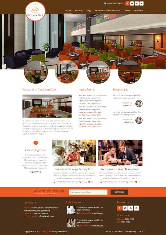
Let’s take an example from Logo Design Pros Portfolio
The Flow of the website
While designing responsive website, it is considerable to notice that every page and every element of the website has to be created with user’s perspective. For this particular website, Logo Design pros establish all the possible entry points and user flow elements that make this website highly responsive and fits with the size of all browsers.
Relative units
Logo Design Pros designer adjust different pixel density with relative units for every canvas be it desktop, mobile screen or anything in between.
Breakpoints
Breakpoints are the points that permit the format of the website to change at predefined points, i.e., having three segments on a desktop and just one segment on mobile phone. Logo Design Pros defined the breakpoints of this website at the exact device widths that the client was looking to target.
Bootstrap
Logo Design Pros designer create this responsive website design with the use of already existing CSS framework.
Max and Min values
We see that often it looks great when the content covers the whole width of the screen on the mobile device. However, stretching the same content to the whole width of any other big screen doesn’t look fine. For this reason, designer use min/max values. Our designers also follow the min/max value element for this particular responsive web design project.
Therefore, in this particular example, Logo Design Pros designer has given a responsive architecture with structured design scale of columns and grids that fits with all device screens with different sizes. So don’t you think that by not offering a responsive version of your site, you are missing a significant portion of visits you get every day? This figure may vary for each web page but with the popularization of mobile devices is definitely an upward trend. So you need a responsive website? Contact Logo Design Pros experienced web designers and complement our work by leaving a comment in Logo Design Pros reviews.


